Eurofast International
Eurofast's rebranding introduces a sleek visual identity, combining modern typography, unique patterns, and versatile logo use, enhancing its global brand presence and ensuring a unified, engaging experience across all platforms.
Client
Services
Industry

Eurofast, with over four decades of expertise, is a trusted advisor in Southeast Europe and the Eastern Mediterranean, offering a broad spectrum of professional services from Tax and Legal Advisory to M&A and Payroll Solutions. Renowned for its efficiency and effectiveness, Eurofast’s mission is to be the go-to partner for businesses seeking reliable, innovative solutions. Our collaboration with Eurofast highlights their client-centric, passionate approach, aligning with our commitment to excellence and innovation in the digital landscape.
In reimagining Eurofast’s brand identity, we delved deep into the essence of what makes a brand truly resonate—its personality, values, and market positioning. Our approach was holistic, considering every visual element as a piece of a larger narrative that collectively defines Eurofast’s unique presence in the industry. At the forefront of this narrative is the logo, a beacon of the brand’s identity, embodying its core values and mission with simplicity and clarity. This rebranding journey is not just about a new look; it’s about crafting a consistent, recognizable image that echoes Eurofast’s commitment to excellence and innovation in financial services.
In a world cluttered with complexity, the Eurofast logo cuts through the noise, offering a clear, memorable visual anchor that ensures immediate brand recall. This simplicity is strategic, allowing the logo to maintain its impact across diverse platforms, from the vastness of billboards to the compact screens of smartphones. The design intertwines the abstract ‘E’ and ‘F’ with a playful circle, creating a dynamic yet cohesive symbol that reflects Eurofast’s layered services and customer-centric approach.
Eurofast’s branding toolkit includes a logo variant featuring a tagline tailored for instances where additional brand messaging is pivotal. This version is particularly effective in advertising or promotional contexts, offering a deeper narrative layer that underscores Eurofast’s core values and services.
The brand icon, ingeniously merging abstract ‘E’ and ‘F’ shapes with a playful circle, stands as a testament to Eurofast’s integrated services and client-centric ethos. This emblem not only pays homage to Eurofast’s heritage but also symbolizes the company’s forward-thinking approach, embodying a blend of tradition and innovation in a single, memorable symbol.

Eurofast’s visual identity features distinctive Filled and Outlined Shape Patterns, adding depth and character to the brand. The Filled Shape Pattern, with its sleek geometric forms, conveys sophistication and a traditional aesthetic, enhancing brand credibility. In contrast, the Outlined Shape Pattern offers a modern, tech-forward look, providing a dynamic visual contrast that enriches Eurofast’s brand presence across all communications.


The primary colors are not just visually appealing but are imbued with meaning, chosen to evoke feelings of support, assurance, and delight at every customer touchpoint. These colors are the brand’s visual signature, consistently applied across all assets to reinforce brand recognition. The secondary colors, used judiciously, add depth and dimension to the visual narrative, enhancing the overall brand experience without diluting its potency.

with the selection of Codec Pro playing a pivotal role in establishing a strong and recognizable brand presence. This font’s ability to support multiple languages, including Latin, Cyrillic, and Greek, is crucial for Eurofast’s international operations, ensuring that promotional materials resonate across diverse linguistic landscapes. Eurofast’s dynamic, high-contrast use of typography underlines the brand’s commitment to clarity, inclusivity, and effective communication, reinforcing its stature as a global player in the financial services sector.


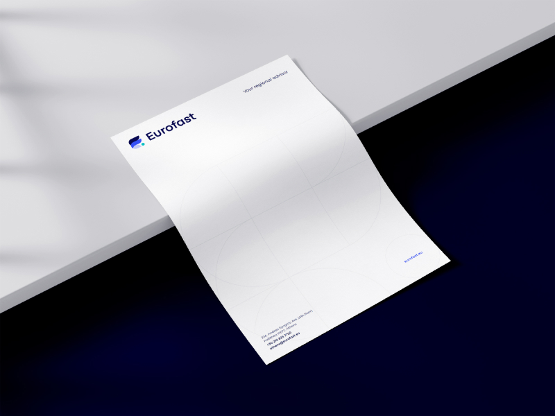
The strategic application of Eurofast’s brand logo across print, social media, and digital materials is pivotal in maintaining a cohesive brand identity. This careful placement ensures that the logo remains clear, recognizable, and impactful, regardless of the medium. By adhering to consistent guidelines for logo usage, Eurofast strengthens its visual presence, ensuring a unified brand experience that resonates with audiences across all touchpoints.


“Partnering with PRAN for Eurofast’s rebranding marked a significant milestone in our brand’s evolution. Their team’s collaborative AND creative approach, along with deep understanding of our core values and market positioning were pivotal in enhancing our brand’s resonance and impact. This partnership has rejuvenated our identity and strengthened our commitment to excellence and innovation, and we couldn’t be more excited for the result and new identify of Eurofast.”